How to use coefplot margins and marginsplot in Stata.

This page has a short link: erka.me/coef1 will bring you back here.
This is not intended to be an exhaustive tutorial, but, rather, a sampling of how to make a few graphs for your (mostly) nonlinear regression models using some stata commands (margins and marginsplots) and some of Ben Jann’s programs (coefplot and grstyle in particular) while making use of Spost13. This should get you started on visuals! This is just round one to get folks something to work with. I made a much better tutorial for you to check out here.
I recommend downloading this do-file and running it first. On Windows, you can right-click and choose “save link as” or if you just click the link, it will open in a new tab, then you can copy it all into a blank do-file if you prefer. However you do it, make that a complete do-file that you have, run, and then save somewhere. What you’re doing is installing several excellent programs for post-estimation work in Stata, including several programs written by statistics pros Ben Jann and Scott Long. And you’ll want to run it later to check for updates on all of it. And I highly recommend Long and Freese (2014) “Regression Models for Categorical Dependent Variables Using Stata” as a go-to reference manual for Stata and nonlinear regression, with an emphasis on interpretation. The book is a companion to the Spost13 Stata commands (that you can use without the book, of course) but the text will help you know what you’re doing.
What do I do first?
Download the initial-erika-setup.do file I made to go with this tutorial. Run it once to install all the programs I use.
What is Spost13?
A suite of programs for the postestimation interpretation
of regression models for categorical outcomes.
and coefplot is …
An expert-user written program for Stata (by Ben Jann) for plotting coefficients. Check out the online documentation.
Let’s start with marginsplot actually
What you see up there is (obviously) a combination of two graphs made into one, which is a thing you can do in Stata. See below.
The best way to learn this part is to just do it. I’m going to share the code that I used and you should try it out with your models and your variables. Make some interaction plots, which can be a helpful visual. Don’t limit yourself to the two that I did here. These are just examples, right?
Here is the code I used to make Figure 1. (Remember to run initial-erika-setup.do file first.) And if you are unsure of something with a built-in Stata function such as marginsplot, just type help marginsplot in the Stata command line to access the robust help documentation. My examples are using margins on a mlogit, with standardized continuous variables, and some styling is set with grstyle. This first chunk of code is long because I’m setting up your starter grstyle code, which is pretty cool and I think you will like it once you learn it. I suggest copying this into a do-file and then editing it with your models, your variable names, etc. See how I labeled my mlogit under the MLOGIT header in my code? I did that so you can hopefully readily see where to substitute your own things.
/*********************************************************
ACKNOWLEDGEMENTS
**********************************************************/
/*My dataset in this demo is Gallup World Poll data, which I cannot share. The post-estimation Spost commands used are courtesy of J.
Scott Long. Many other commands are courtesy of
Ben Jann, including coefplot, center, and grstyle.
References:
Ben Jann, 2013. "COEFPLOT: Stata module to plot regression
coefficients and other results," Statistical Software Components
S457686, Boston College Department of Economics, revised 17 Dec 2020. http://repec.sowi.unibe.ch/stata/coefplot/index.html
J. Scott Long & Jeremy Freese. 2014. "Regression Models for
Categorical Dependent Variables Using Stata", 3rd Edition. College
Station, TX: Stata Press. https://jslsoc.sitehost.iu.edu/spost13.htm
*/
/*********************************************************
MLOGIT
**********************************************************/
/*
multinomial logit model (MNLM):
Y = LifeEval (Life Evaluation Index, evaluative well-being)
C = income_2 (household income in international dollars)
F = Corruption (Corruption Index - perceived govt and business corruption)
Xs = gender, urbanicity, age, education, Region
I am estimating the MNLM of Y on C, F, and X.
*/
//multinominal logit model
svy: mlogit LifeEval c.income_2 i.Corruption i.gender i.urbanicity c.age ///
i.education i.Region, base(2) noci //base(2)=suffering, middle category ref.
eststo mlogitLE
mlogtest
mlogtest, combine //Wald test to make sure this model can distinguish outcomes
/* btw mlogtest is an spost command, and it's testing all of your IVs at once
for you. Check out the output on this...you can add in a log ratio test if you
want by adding a lr */
//multinomial logit model with interaction term
svy: mlogit LifeEval c.income_2 i.Corruption i.gender i.urbanicity c.age ///
c.income_2#i.Corruption i.education i.Region, base(2)
eststo mlogitLE_with_interact
/**********************************************************
grstyle - for styling graphs - written by Ben Jann
**********************************************************/
*Graph Settings - set up how I like them. Click thru the docs to set your way.
//Documentation is here: http://repec.sowi.unibe.ch/stata/grstyle/
//YES, you can completely skip grstyle if you want to just use Stata defaults
grstyle clear //resets any previous grstyle in the file
grstyle init //initializes grstyle to get ready to run
grstyle set horizontal //sets y axis tick labels horizontal/readable
grstyle set ci //makes shading of CIs transparent
grstyle set grid //turns on all grid lines, horiz, vert, min and max
grstyle set legend 6 //clock position; add ", inside" to move it inside graph
grstyle color background white
grstyle yesno draw_major_hgrid yes
grstyle yesno draw_major_ygrid yes
grstyle linepattern major_grid dot
grstyle linewidth plineplot medthick
grstyle anglestyle vertical_tick horizontal
grstyle symbolsize p large
grstyle gsize axis_title_gap tiny //adds space between ticks and axis titles
grstyle color major_grid black
grstyle linewidth major_grid thin
grstyle set size small: subheading axis_title
grstyle color p1markline navy%0
grstyle color p1markfill navy%100
grstyle color p2markline maroon%0
grstyle color p2markfill maroon%100
grstyle color p3markline forest_green%0
grstyle color p3markfill forest_green%100
grstyle color p4markline dkorange%0
grstyle color p4markfill dkorange%100
grstyle color p5markline teal%0
grstyle color p5markfill teal%100
grstyle color ciarea navy%100
grstyle color ci2_area maroon%100
grstyle color ci3_area forest_green%100
/****************************************************************
Interaction Plots - predicted probabilities - using MARGINSPLOT
*****************************************************************/
/*
PREDICTED PROBABILITIES:
Predicted probabilities refer to the predicted probability of one given outcome category, compared to all other outcome categories. Does not matter what base or reference is used. For mlogit, I will use margins to make the predictions and marginsplot to graphically display the predicted probabilities.
*/
//marginal effects of income
estimates restore mlogitLE_with_interact
mchange Corruption income_2 , amount(sd)
margins Corruption, dydx(income_2) vce(unconditional)
/*btw that vce(unconditional) is there to take out the robust vce implied from
using pweight in the model and this marginsplot is for the Average Marginal Effects
(AME) of income w/95%CIs */
summarize income_2 , detail //continuous variable;to see IQR, percentiles, etc.
estimates restore mlogitLE_with_interact
margins, at(income=(280(6200)31280)) // I chose middle 98% range of HH income
//starts at 280, goes to 31280, in increments of 6200; that's how that works
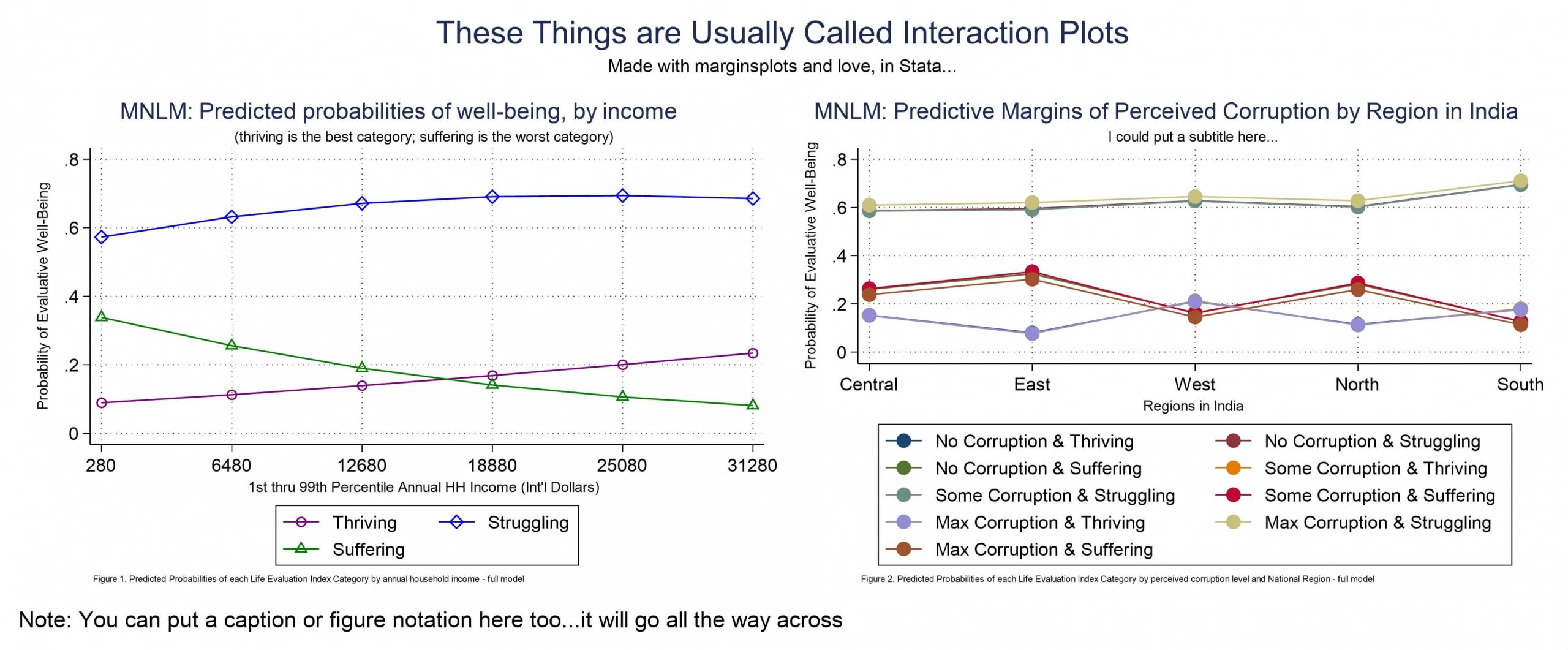
marginsplot , ///
allsimplelabels noci ///
title("MNLM: Predicted probabilities of well-being, by income") ///
subtitle("(thriving is the best category; suffering is the worst category)") ///
xtitle("1st thru 99th Percentile Annual HH Income (Int'l Dollars)") ///
ytitle("Probability of Evaluative Well-Being") ///
xlabel(280(6200)31280) ///
caption("Figure 1. Predicted Probabilities of each Life Evaluation Index Category by annual household income - full model", size(*0.5)) ///
plot1opts(lpattern(solid) ms(oh) color(purple) ) ///
plot2opts(lpattern(solid) ms(dh) color(blue) ) ///
plot3opts(lpattern(solid) ms(th) color(green) ) ///
legend(order(1 "Thriving" 2 "Struggling" 3 "Suffering") ) ///
name(MNLMincome)
graph export `pgm'-MNLM-marginsplot-1.emf, replaceAnd I think you should make a version of Figure 2, because then you’ll be able to try out the way I explain how to combine graphs. This is the code to produce Figure 2 as above.
/* plotting corruption by region */
estimates restore mlogitLE_with_interact
quietly margins Corruption#Region, asbalanced
marginsplot, x(Region) noci ///
title("MNLM: Predictive Margins of Perceived Corruption by Region in India") ///
subtitle("I could put a subtitle here...") ///
legend(order(1 "No Corruption & Thriving" ///
2 "No Corruption & Struggling" ///
3 "No Corruption & Suffering" ///
4 "Some Corruption & Thriving" ///
5 "Some Corruption & Struggling" ///
6 "Some Corruption & Suffering" ///
7 "Max Corruption & Thriving" ///
8 "Max Corruption & Struggling" ///
9 "Max Corruption & Suffering")) ///
xtitle("Regions in India") ///
ytitle("Probability of Evaluative Well-Being") ///
caption("Figure 2. Predicted Probabilities of each Life Evaluation Index Category by perceived corruption level and National Region - full model", size(*0.5)) ///
name(MNLMcorruption)
graph export `pgm'-MNLM-marginsplot-2.emf, replace
And if you made figure 1 and figure 2, in some form, the following code will let you combine them to have one graph output file, which is useful. You should also see how to modify this for other use cases.
/*To combine marginsplots together into one graph export, I do it this way. There are other ways - I just like this way so I share it, if you want to use:
*/

graph combine MNLMincome MNLMcorruption, xsize(6.5) ysize(2.7) ///
iscale(.8) name(MarginsPlotsCombo) ///
title("These Things are Usually Called Interaction Plots") ///
subtitle("Made with marginsplots and love, in Stata...") ///
caption("Note: You can put a caption or figure notation here too...it will go all the way across")
graph close MNLMincome MNLMcorruption
graph export `pgm'-MNLM-marginsplot-combo.emf, replace
okay, okay. Let’s use coefplot now
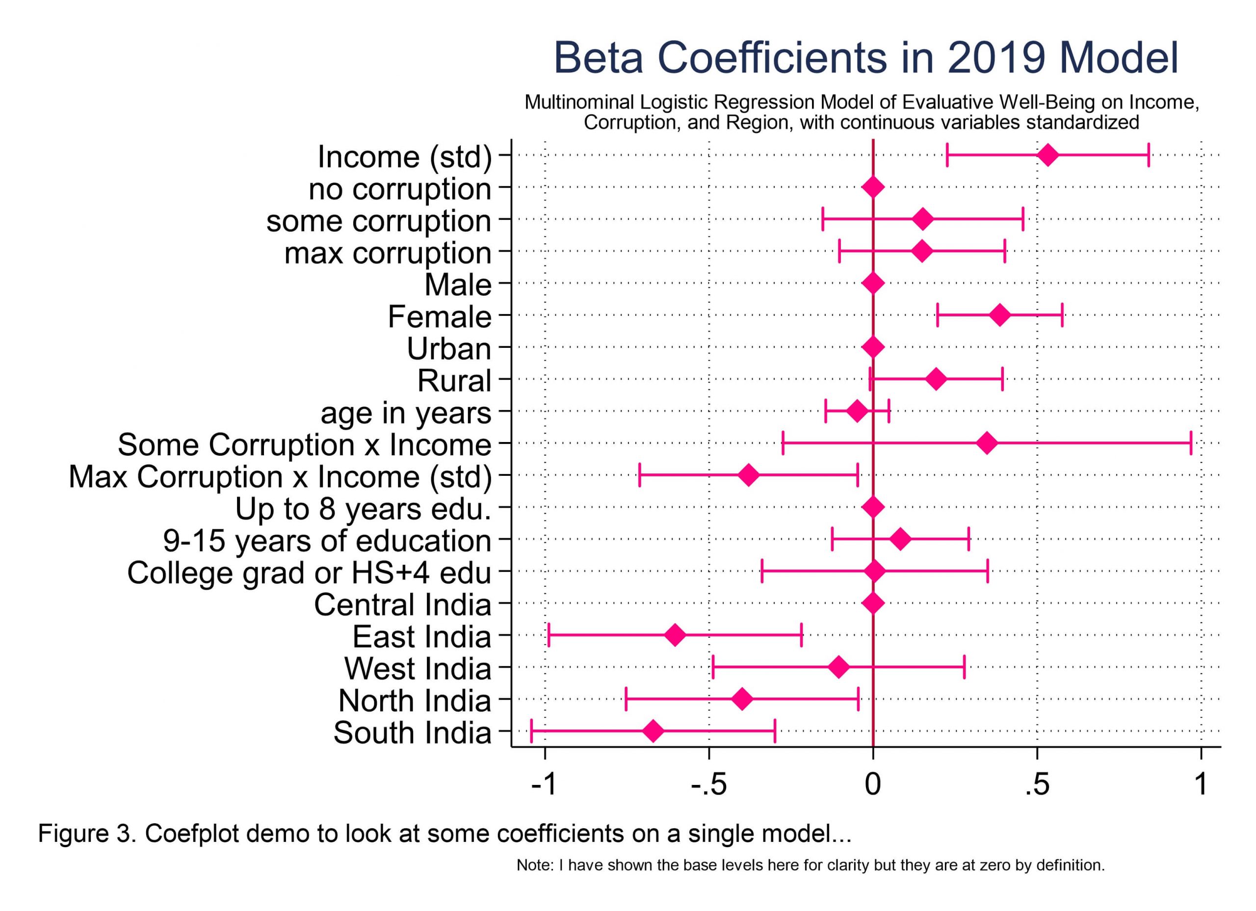
Okay. So what you see in Figure 3 above is the most basic use for coefplot and that is to plot coefficients. I mean, you know what nonlinear regression output looks like, yeah?
I should make a nice regression table and put it here. Because we absolutely do need to make those too, for the sake of precision, and who doesn’t like seeing little * significance stars ** on our work, right? But if you just want a sense of which coefficients are having the most influence in your model and how? You could use coefplot. Seriously. It’s also really useful for comparing several models, because you can put plots side by side, or on top of one another for that matter, to readily see the similarities and differences between models. Super helpful, and you can make some great looking visuals for your posters and publications.
Here is the code I used to make Figure 3 as above.
/* In statistics, we can standardize things on different scales so that
we can make comparisons about relative magnitude.
We're going to do that now using Ben Jann's center command to do it.
It standardizes continuous variables to a mean of zero and SD of 1. Like this:
*/

center income_2 age, standardize prefix(std_)
//then check them (mean is not zero only due to rounding errors)
summarize income_2 std_income_2 age std_age

/*
BTW to get the exact names of coefficients stata is using, so that you can
rename them like I am doing here, use this:
mlogit, coeflegend
*/

//super basic coefplot example to visualize coefficients of a single model
//running mlogit with standardized variables
mlogit LifeEval c.std_income_2 i.Corruption i.gender ///
i.urbanicity c.std_age c.std_income_2#i.Corruption i.education ///
i.Region if YEAR_WAVE==2019
eststo std_mlogitfull2019

//coefplot as seen in Figure 3
coefplot (std_mlogitfull2019), ///
drop(_cons) xlabel(, grid) baselevels xline(0) headings(, labsize(vsmall)) ///
ciopts(recast(rcap) color(pink)) citop ///
msymbol(D) mcolor(pink) msize(medium) ///
title("Beta Coefficients in 2019 Model") ///
subtitle("Multinominal Logistic Regression Model of Evaluative Well-Being on Income," ///
"Corruption, and Region, with continuous variables standardized", size(*0.8)) ///
coeflabels(std_income_2="Income (std)" ///
std_age="age in years" ///
O.Corruption="No Corruption" ///
5O.Corruption="Some Corruption" ///
10O.Corruption="Max Corruption" ///
1.gender = "Male" ///
2.gender = "Female" ///
0.Corruption#c.std_income_2 = "No Corruption x Income (std)" ///
50.Corruption#c.std_income_2 = "Some Corruption x Income" ///
100.Corruption#c.std_income_2 = "Max Corruption x Income (std)" ///
1.education = "Up to 8 years edu." ///
2.education = "9-15 years of education" ///
3.education = "College grad or HS+4 edu" ///
1.Region = "Central India" ///
2.Region = "East India" ///
3.Region = "West India" ///
4.Region = "North India" ///
5.Region = "South India" ///
1.urbanicity = "Urban" ///
2.urbanicity = "Rural") ///
caption("Note: I have shown the base levels here for clarity but they are at zero by definition.", size(*0.5)) ///
note("Figure 3. Coefplot demo to look at some coefficients on a single model...", span) ///
name(coefplot1)
graph export `pgm'-MNLM-coefplot-1.emf, replace
What if you do not want all of those coefficients in the plot? You can use drop or keep. Keep commands tend to freak me out (because if you omit something you want to keep, it’s gone, whereas if you forget to drop something you just have an extra thing to drop). I just find it emotionally less riskly to use drop commands, so that’s what you’ll see in the code below, to make Figure 7, which is the same as Figure 3, plus some drops. See below.
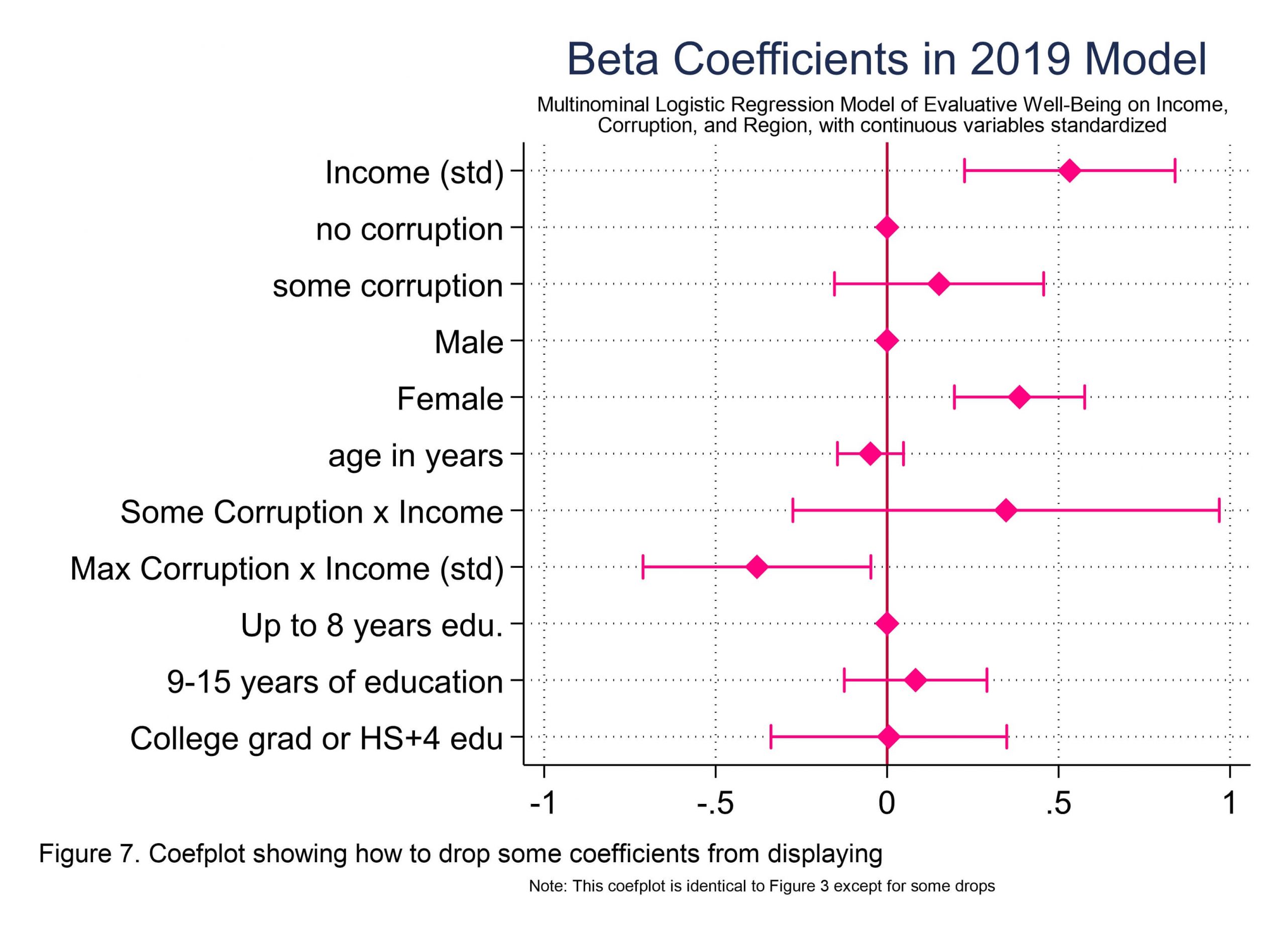
//coefplot for figure 7, which is Figure 3 with some coefficients removed
//Note structure of the drop command, and the difference between the above two visuals

estimates restore std_mlogitfull2019
coefplot std_mlogitfull2019, ///
drop(_cons || *.Region || *.urbanicity || 100.Corruption) ///
xlabel(, grid) baselevels xline(0) headings(, labsize(vsmall)) ///
//snip...the rest is the same as for Figure 3
I am trying to decide which is the better outcome variable: the 3-level Life Evaluation Index variable that Gallup computes for each individual (and is derived from the two Cantril Ladder evaluative well-being questions), OR the continuous-ish variable that I generated by averaging those two Cantril Ladder variables. In favor of the LadderAve variable is that it has more information, more detail per person. In favor of the Life Evaluation Index variable is that Gallup created this considering other things that are known about well-being, presumably some factor analysis on other items, for example. Still, I created the following graphic. It shows the models that result from the Life Evaluation Index that Gallup created using their extra info (navy), and the models that result from simple mean of the two items (orange). It’s tedious, but I will share the exact code below the image.
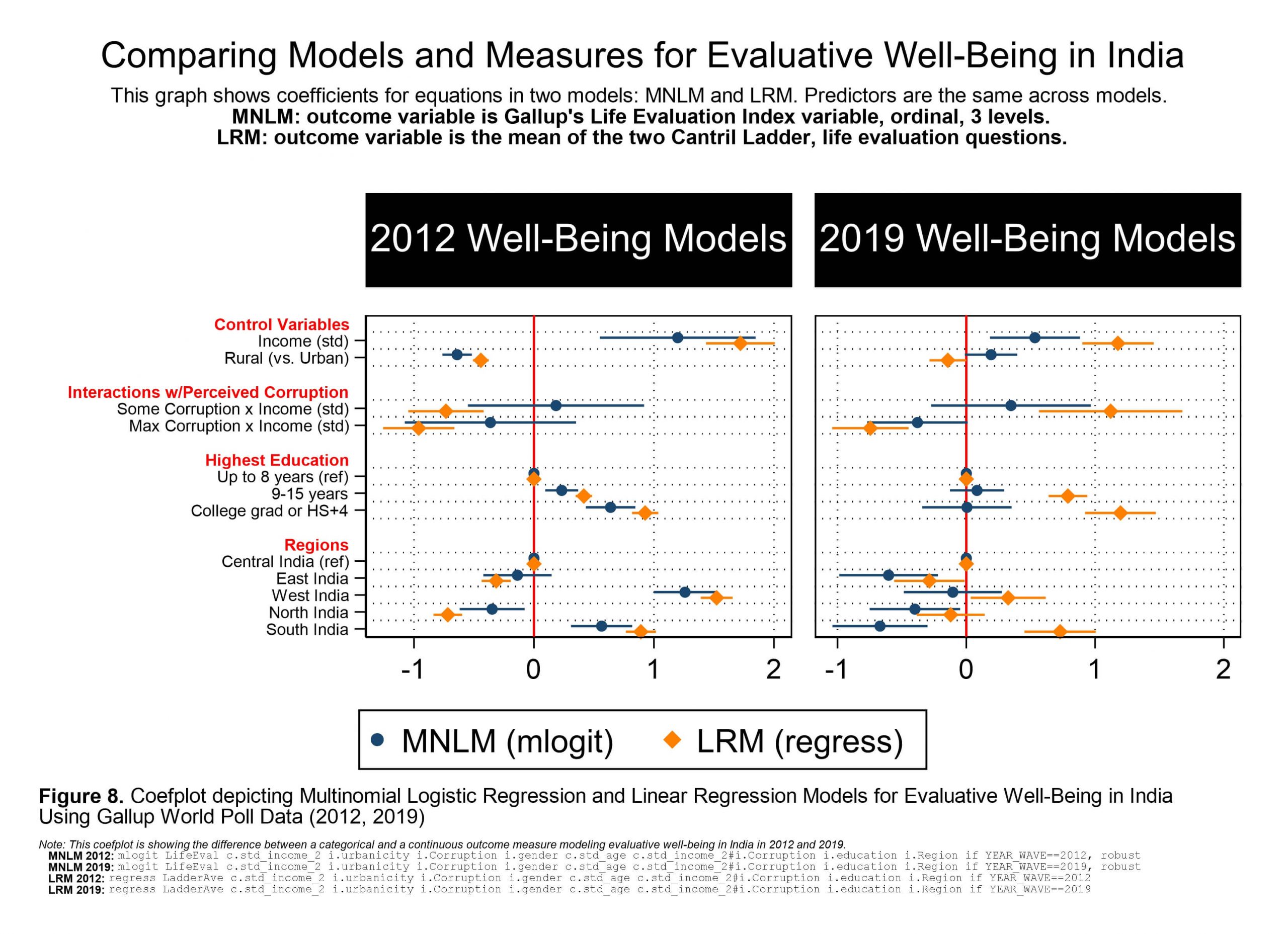
//making figure 8, coefplot of 2012 & 2019 mlogit for LifeEval OLS on LadderAve
 coefplot ///
 (mlogit2012, label(MNLM (mlogit)) mcolor(navy) ciopts(color(navy)) )  ///
 (lrm2012, label(LRM (regress)) mcolor(orange) ciopts(color(orange)) ), ///
 bylabel(2012 Well-Being Models)   ///
 || (mlogit2019) (lrm2019), bylabel(2019 Well-Being Models)  ///
 ||, drop(_cons || std_age || *.gender || 1.urbanicity || *.Corruption) ///
 ciopts(recast(rcap)) ///
 subtitle(, size(large) margin(medium) justification(center) ///
 color(white) bcolor(black) bmargin(top_bottom)) ///
 byopts(xrescale ///
 title("Comparing Models and Measures for Evaluative Well-Being in India", size(*0.8)) ///
 subtitle("This graph shows coefficients for equations in two models: MNLM and LRM. Predictors are the same across models." ///
"{bf:MNLM: outcome variable is Gallup's Life Evaluation Index variable, ordinal, 3 levels.}" ///
"{bf:LRM: outcome variable is the mean of the two Cantril Ladder, life evaluation questions.}" ///
, size(*0.8)) ///
caption("{it:Note: This coefplot is showing the difference between a categorical and a continuous outcome measure modeling evaluative well-being in India in 2012 and 2019.}" ///
"   {bf:MNLM 2012:} {stMono:mlogit LifeEval c.std_income_2 i.urbanicity i.Corruption i.gender c.std_age c.std_income_2#i.Corruption i.education i.Region if YEAR_WAVE==2012, robust}" ///
"   {bf:MNLM 2019:} {stMono:mlogit LifeEval c.std_income_2 i.urbanicity i.Corruption i.gender c.std_age c.std_income_2#i.Corruption i.education i.Region if YEAR_WAVE==2019, robust}" ///
"   {bf:LRM 2012:} {stMono:regress LadderAve c.std_income_2 i.urbanicity i.Corruption i.gender c.std_age c.std_income_2#i.Corruption i.education i.Region if YEAR_WAVE==2012}" ///
"   {bf:LRM 2019:} {stMono:regress LadderAve c.std_income_2 i.urbanicity i.Corruption i.gender c.std_age c.std_income_2#i.Corruption i.education i.Region if YEAR_WAVE==2019}" ///
, size(*0.35)) ///
note("{bf:Figure 8.} Coefplot depicting Multinomial Logistic Regression and Linear Regression Models for Evaluative Well-Being in India" "Using Gallup World Poll Data (2012, 2019)", ///
size(*0.8)) ///
) ///
headings(50.Corruption#c.std_income_2 = "{bf:Interactions w/Perceived Corruption}" ///
std_income_2 = "{bf:Control Variables}" ///
1.education = "{bf:Highest Education}" ///
1.Region = "{bf:Regions}" ///
0.Corruption = "{bf:Perceived Corruption}", ///
labsize(vsmall) labcolor(red) ) ///
ylabel(,labsize(vsmall)) ///
xlabel(, grid) baselevels ///
xline(0, lcolor(red) lwidth(medium) lpattern(solid)) ///
msize(small) ///
coeflabels(std_income_2="Income (std)" ///
std_age="age in years" ///
2.urbanicity = "Rural (vs. Urban)" ///
0.Corruption#c.std_income_2 = "No Corruption x Income (std)" ///
50.Corruption#c.std_income_2 = "Some Corruption x Income (std)" ///
100.Corruption#c.std_income_2 = "Max Corruption x Income (std)" ///
1.education = "Up to 8 years (ref)" ///
2.education = "9-15 years" ///
3.education = "College grad or HS+4" ///
1.Region = "Central India (ref)" ///
2.Region = "East India" ///
3.Region = "West India" ///
4.Region = "North India" ///
5.Region = "South India")
name(coefplot8)
graph export `pgm'-coefplot-figure-8.emf, replace

//to construct the regression table that reflects these models in Figure 8:
esttab mlogit2012 mlogit2019 ///
lrm2012 lrm2019 ///
using "fig8regressiontable.rtf", se r2 ar2 replace //you can then open&edit that file
/*pro tip take note of this export for regression table, if you are doing this manually
AND BOOKMARK THIS SITE RIGHT NOW because you can make Stata export publication-ready
regression tables if you format, which I have not done here, but you can (See docs:)
http://repec.org/bocode/e/estout/esttab.html
You already installed esttab if you ran my initial-erika-setup.do file.
*/
Oh, btw – I always export graphs in .svg or .emf file format, which is Enhanced (Windows) Meta Format, because they are a vector file format and thus can be resized without losing any acuity. What you see here are jpg files because this is a website, but you never want to have Stata export as a jpg or another rasterized image or bitmap file. No. If you use Mac, you can export in SVG format, another vector option. One exception to this is if you are making a post on statalist.org; they only want png format if you insist on attaching an image to your post.
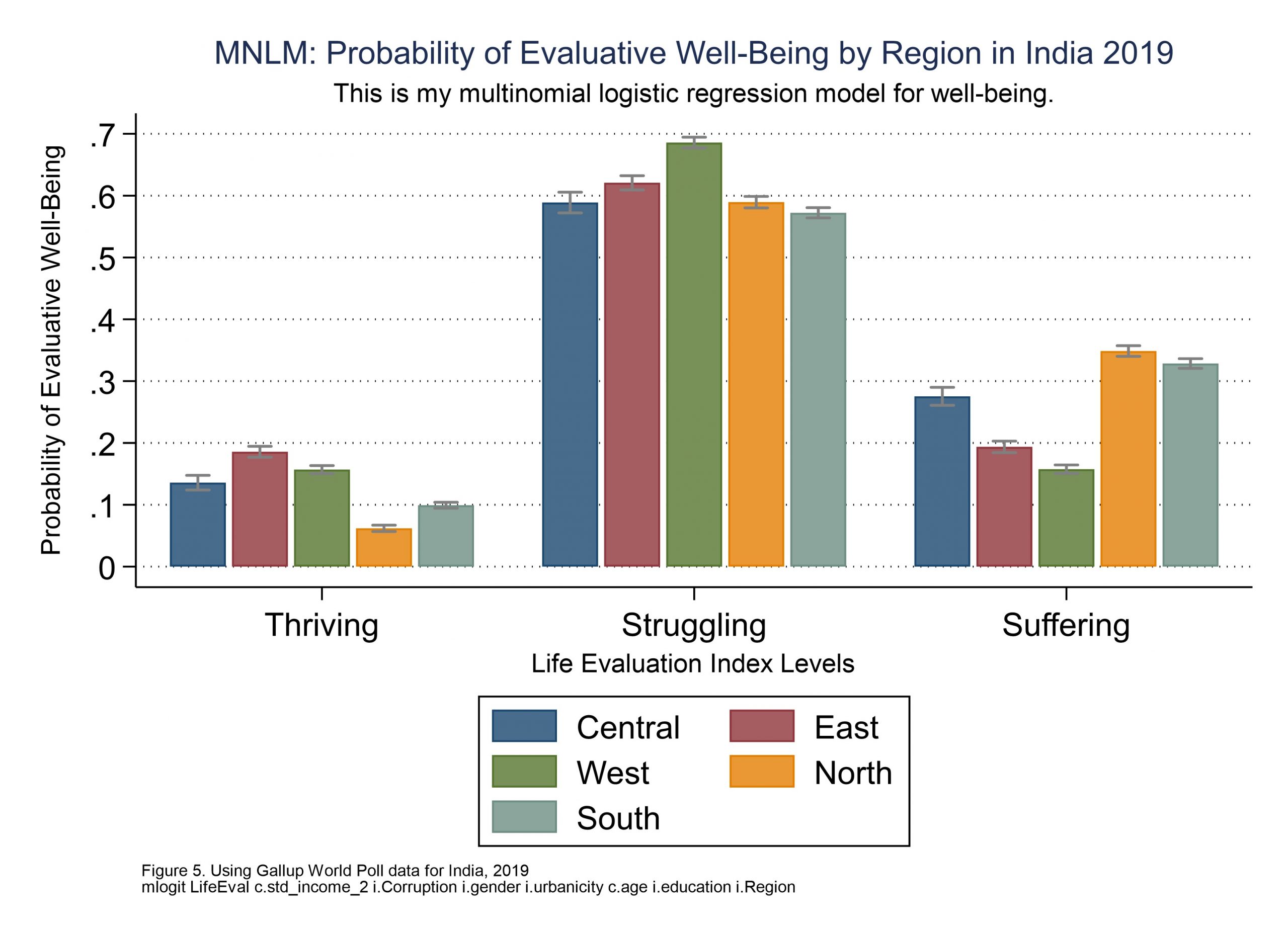
Here’s another potentially helpful use case for coefplot: How can you see the differences between an ordinal logistic regression and a multinomial logistic regression model? I mean, if you have an ordinal outcome variable, that is, and the parallel regression assumption that an ordinal logit requires is not violated, you can compare them and choose, right? You sacrifice the benefits of ordinality when you choose mlogit, but making the more conservative choice can also be wise. You can use coefplot to visualize mlogit and ologit models, to see how different they really are. In my example here neither model is particularly interesting, but check this out for the use case…
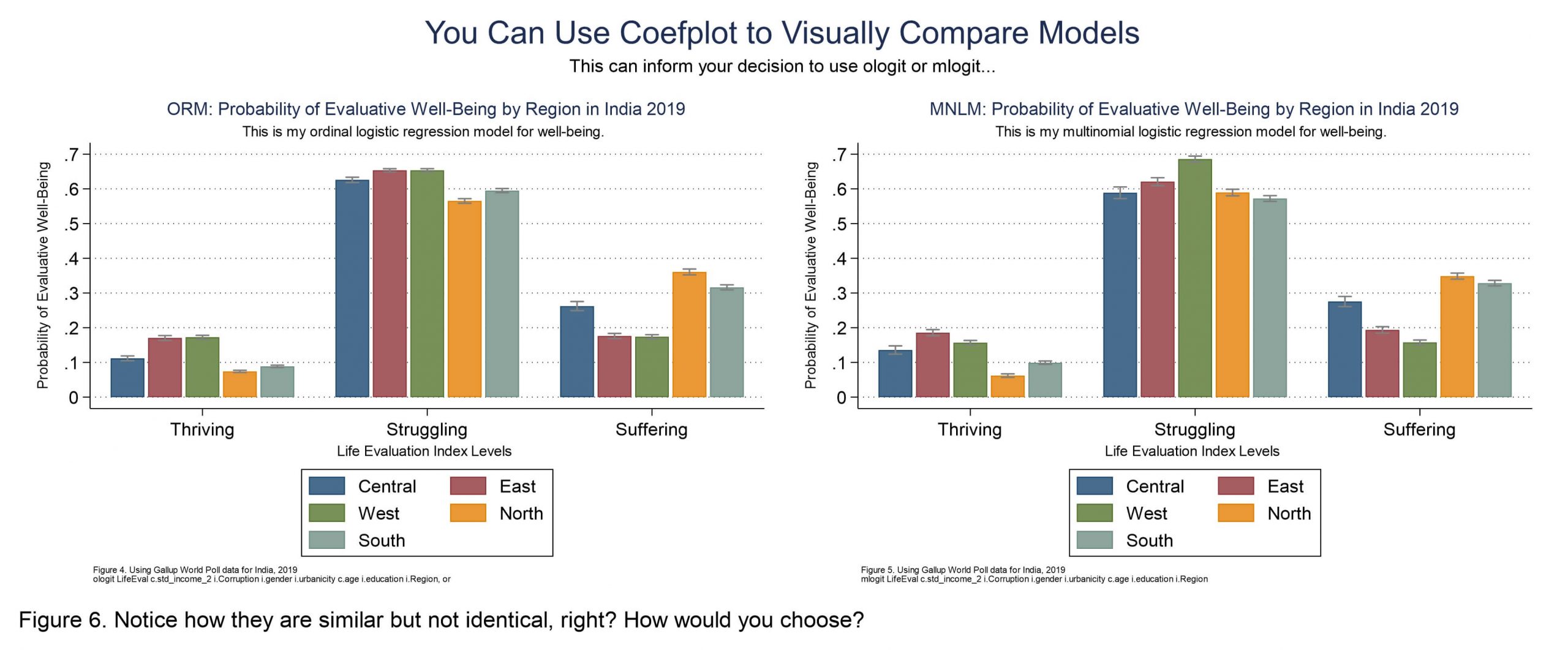
Rather than taking time to talk through how to make both of the above, and then export them as one graph (which is done with “graph combine” just like with the marginsplots above), I will just share code to make Figure 5. Everything on this page assumes you ran my initial-erika-setup.do file first, for anyone who’s just coming in down here on the page and skipped the top parts. You need to install those things before these things will work. But okay, let’s look at this mlogit and coefplot. Don’t forget, help coefplot in Stata and the coefplot website are you go-to sources for complete documentation. I’m just showing you some samples.
//here is the mlogit graph as seen in Figure 5
//mlogit first
mlogit LifeEval c.std_income_2 i.Corruption i.gender i.urbanicity c.age ///
i.education i.Region
eststo M
listcoef, percent help //returns the coeficients; "help listcoef" to learn

//now the margins
estimates restore M
margins, at(Region=1) post
est store mcentral
estimates restore M
margins, at(Region=2) post
est store meast
estimates restore M
margins, at(Region=3) post
est store mwest
est restore M
margins, at(Region=4) post
est store mnorth
est restore M
margins, at(Region=5) post
est store msouth

//and coefplot for figure 5
/*Coefplot here depicts the predicted probabilities for life evaluation outcomes,
for a factor variable (Region) showing probability levels across groups.*/
coefplot mcentral mwest msouth meast mnorth, ///
recast(bar) barw(0.15) vertical ylab(0(.1).7) ///
ciopts(recast(rcap) color(gs8)) citop ///
xlab(1 "Thriving" 2 "Struggling" 3 "Suffering") ///
legend(order(1 "Central" 3 "East" ///
5 "West" 7 "North" 9 "South")) ///
ytitle("Probability of Evaluative Well-Being") ///
xtitle("Life Evaluation Index Levels") ///
title("MNLM: Probability of Evaluative Well-Being by Region in India 2019", size(*0.7))	///
subtitle("This is my multinomial logistic regression model for well-being.")	///
caption("Figure 5. Using Gallup World Poll data for India, 2019" ///
"mlogit LifeEval c.std_income_2 i.Corruption i.gender i.urbanicity c.age i.education i.Region", size(*0.5)) ///
name(coefplot3)
graph export `pgm'-comparing-coefplot-3.emf, replace
Sorry, I don understand how to showing probability levels across groups in Figure 5. I run the code you provide but can not get the same graph, but clustered by the same region.
Hi Ellie, Sorry you’re not getting the graph you’re hoping for on your end. This Stata code should work when run thru end to end in Stata 16 or later (it’s been downloaded by others over 20k times).
My blog isn’t set up to receive code snippets and offer troubleshooting, but statalist is. If you have a specific issue (with coefplot?) you could run out by folks there.
Good luck.
Also click thru the link on top of this page to the updated tutorial if you want to try it – I just realized you’re commenting on the older one. They both work, but the newer one is better organized. ✌️